 Unlimited Dream Co.
Initial images are a powerful way to improve the quality of your images and be more creative with VQGAN + CLIP (VQC).
In this article I’ll explain how they work, demonstrate some techniques that I've found useful and hopefully inspire you to explore further in your own creative practice.
About initial images
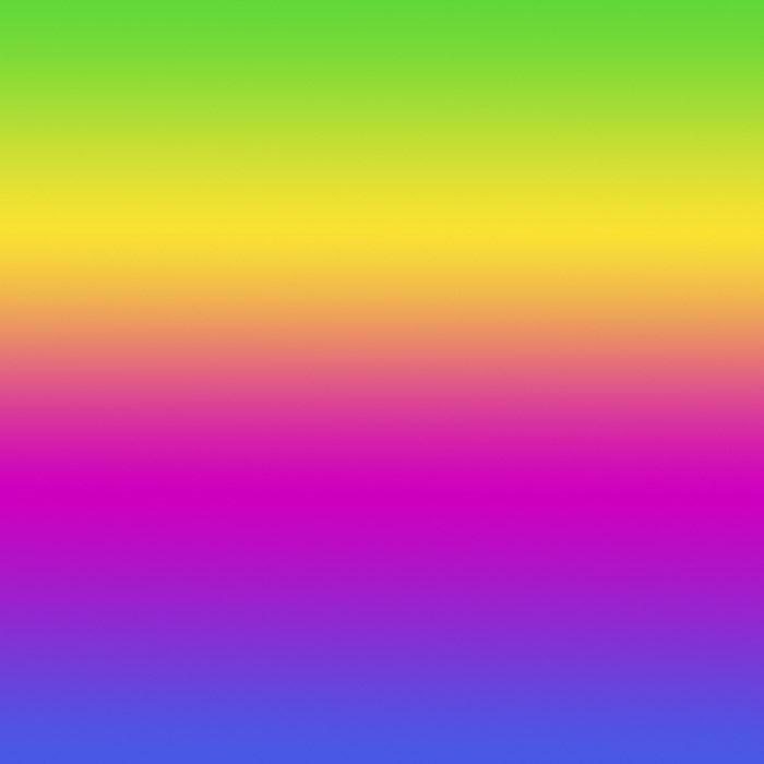
When beginning a run VQG starts with a noise pattern that's generated by the seed – the brown splodgy brown image that first appears. The pattern determines how the image develops, which is why changing the seed changes the final result.
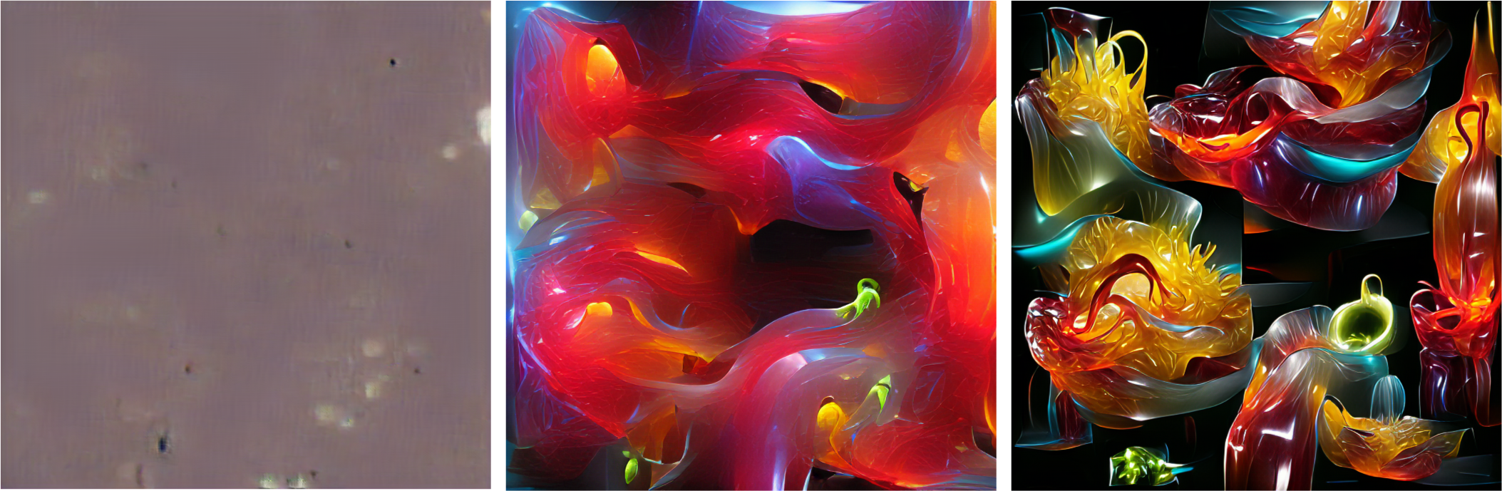
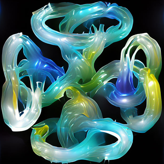
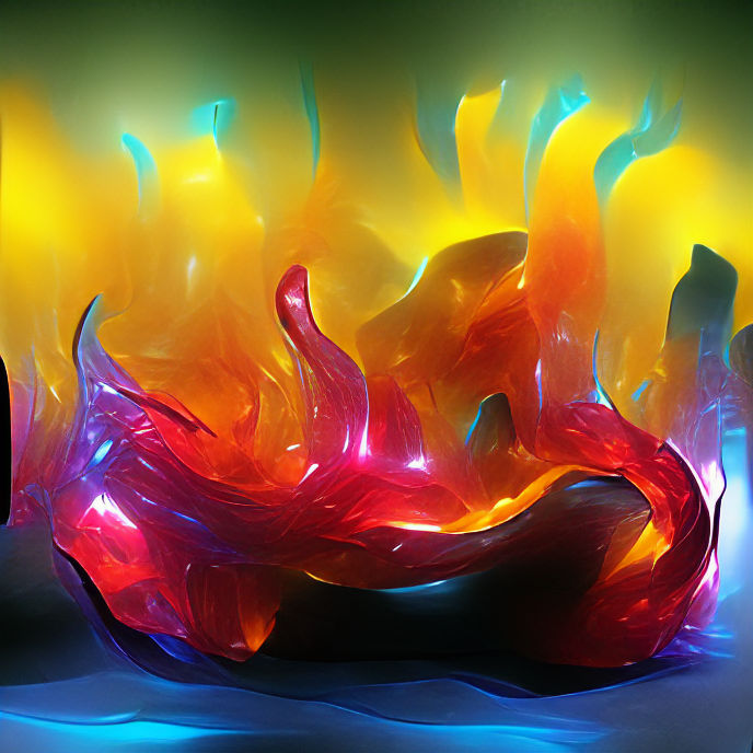
↑ ‘Abstract forms made of glowing translucent vivid colourful glass by Dale Chihuly | Artstation’
0, 200 and 1000 iterations.
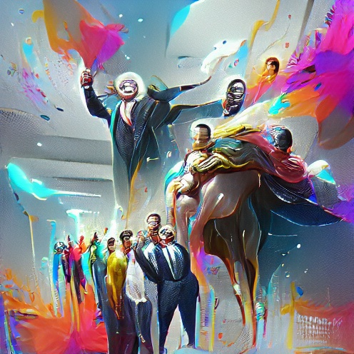
This random starting point, combined with the way CLIP works, means VQC isn't very good at creating coherent images. Rather than looking at the entire canvas, CLIP splits the canvas into small areas called cutouts and works into each one individually. As the generation progresses, the individual cutouts get more prominent. If your prompt is 'A cathedral in the sky', instead of creating one cathedral in the center of the image surrounded by clouds, you'll get multiple cathedrals surrounded by clouds as each cutout does it's own thing.
This is what leads to the distinctive patchwork effect that most VQC-generated images have. There’s no way to avoid this other than to stop generation before the effect gets too pronounced. Other models like CLIP-guided diffusion are better at creating more coherent images but have drawbacks in other areas.
↑ Examples of the cutout effect, showing hard edges between elements and repeating objects.
This is where initial images (inits) are useful. By replacing the noise pattern with an image, you can provide your own structure for the generation to form around, directing the process and gaining more creative control.
Choosing and making initial images
It’s important to remember that the init is the starting point, not the end. Your image doesn’t need to look anything like the final result, it just needs to provide a solid structure with enough detail and contrast to anchor the generation and shape the output.
Using shape and texture
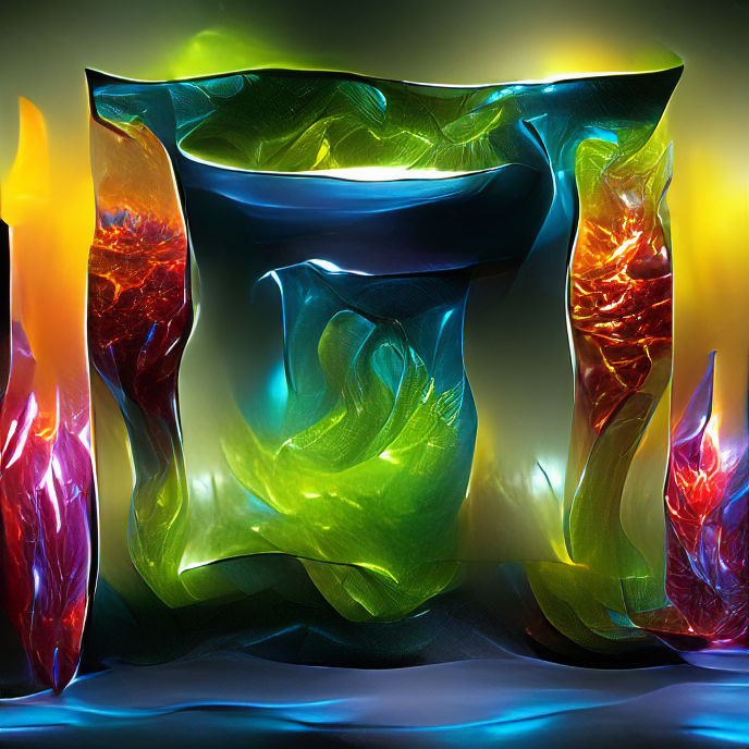
↑ ‘Abstract forms made of glowing translucent vivid colourful glass by Dale Chihuly | Artstation’
Initial image, 200 iterations.
Compared to the first example, the image has developed faster and has a better structure. It's taken the shape of the init and the glass elements have formed in the places with noise, but not in the solid black and white areas.
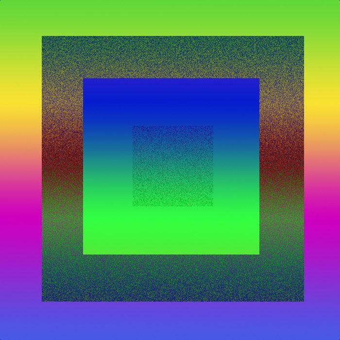
↑ ‘Abstract forms made of glowing translucent vivid colourful glass by Dale Chihuly | Artstation’, showing a solid colour initial image and at 200 iterations.
The system needs noise and contrast, so solid areas will surpress the generation effect. In this example, elements have only just started to form at 200 iterations. They'll eventually develop as normal, but it'll take longer.
↑ ‘Abstract forms made of glowing translucent vivid colourful glass by Dale Chihuly | Artstation’, initial image, 200 iterations.
It's possible to use this suppression effect creatively, coaxing the system to create shapes and compositions it wouldn't normally. Greyscale images create a sort of depth map effect, adding a three-dimensional feel to the image.
Using colour
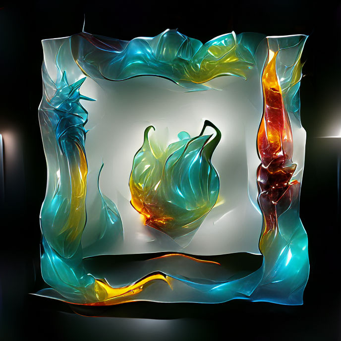
↑ ‘Abstract forms made of glowing translucent vivid colourful glass by Dale Chihuly | Artstation’, initial image, 200 and 1000 iterations.
While colour should really be specified in the prompt rather than the init, adding colour can lend an interesting effect. However, it won’t last beyond around 2-300 iterations and will always be overridden by the prompt if you’ve specified a different colour. Here, the colour effect is pretty much gone by 1000 iterations.
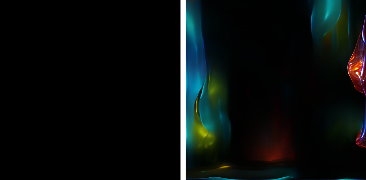
↑ ‘Abstract forms made of glowing translucent vivid colourful glass by Dale Chihuly | Artstation’, initial image and 200 iterations.
This shows how adding colour can change the result. Some of the colour has come through and the colour gradient has provided enough noise for elements to generate.
Supporting the prompt
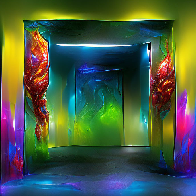
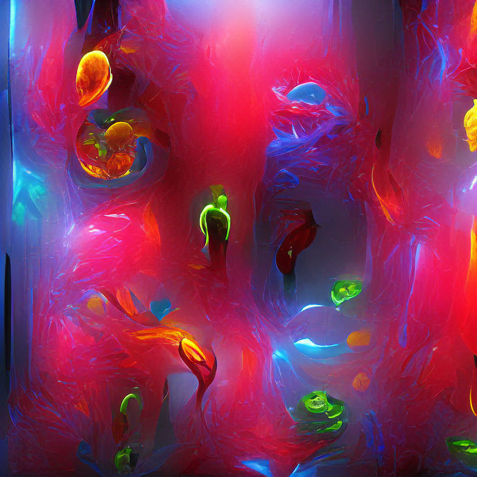
↑ ‘A doorway made of glowing translucent vivid colourful glass by Dale Chihuly | Artstation’, with and without an initial image at 200 iterations.
Initial images work best if they complement your prompt in some way – they don’t need to and probably shouldn’t directly reference each other, but if you can get them to work together you’ll end up with a much stronger result.
Without an init there’s no structure to coalesce around, so each CLIP cutout starts forming its own elements and the result is a bit of a mess.
In contrast, the example with an init has a reasonable composition and looks much more like what you’d expect from the prompt. Even though the init doesn’t look like a doorway it does provide enough of a hint for CLIP to understand and work into.
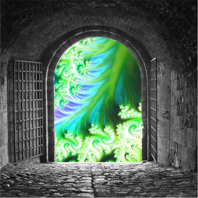
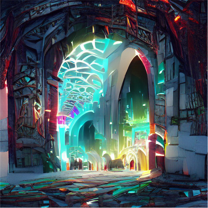
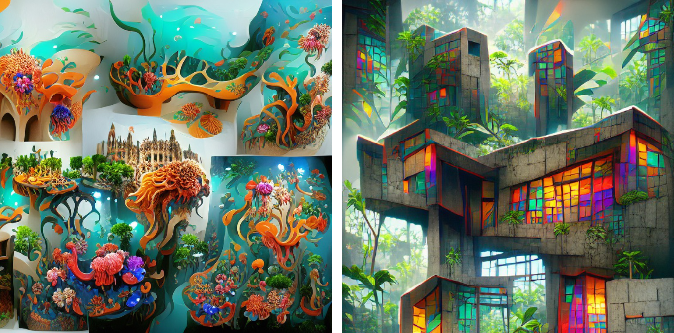
↑ 'A future city seen through an old stone doorway | Artstation'
VQC likes doorways.
When initial images don’t work
Some images just don’t work well as inits, either because they don’t have enough contrast or they contain elements that confuse CLIP, for example faces.
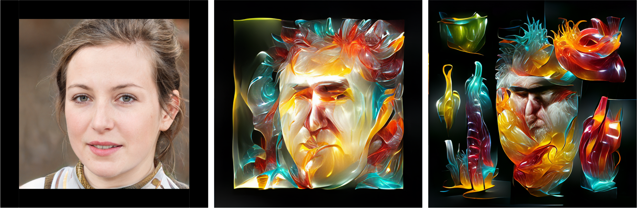
↑ ‘Abstract forms made of glowing translucent vivid colourful glass by Dale Chihuly | Artstation’, initial image, 200 and 1000 iterations. Image from This Person Does Not Exist.
This image starts to go wrong almost immediately. CLIP recognises there’s a face, but as we’ve mentioned Dale Chihuly in the prompt it tries to make the face look like him. VQC is notoriously bad at faces so the result is mangled. Unless that's what you were going for of course.
I hope this has helped you understand what initial images can do and give you pointers for using them creatively in your own work. As ever, the most important thing to do is experiment and discover what works best for you. Have fun!
Thanks for reading! If you have any questions, comments or suggestions, I’d love to hear from you. Give me a shout on Twitter, or send an email.